A Case Study:
Creating Optimal Categorization & Site Navigation
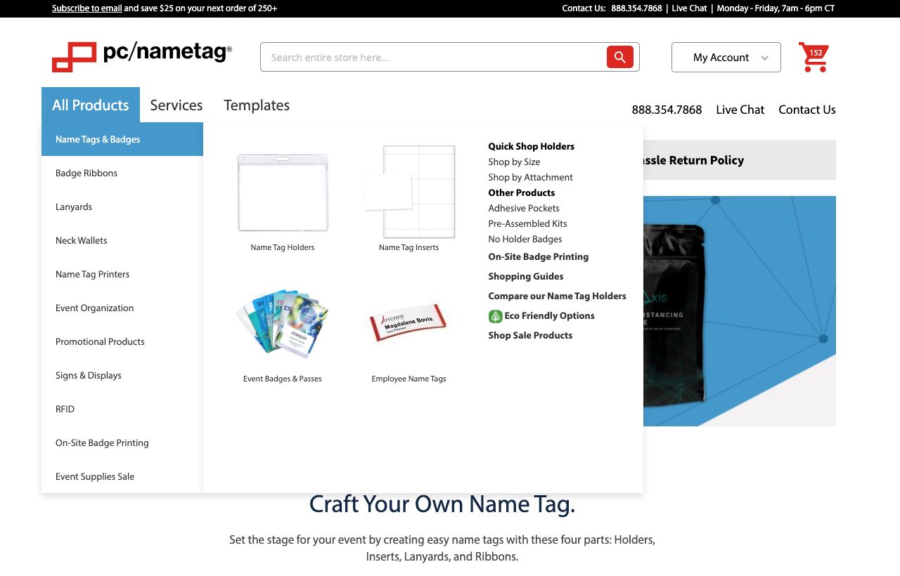
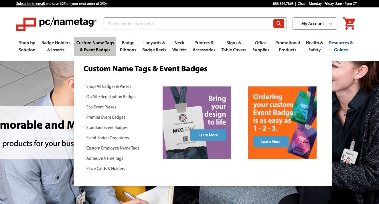
Figure 1.7 - Before and after visuals of pcnametag.com’s product categorization and site navigation.
Project Overview
This project was for pcnametag.com's ecommerce store. They are an event and conference supply business that began as a catalog company. I was the UX lead on this project and worked closely with a ecommerce manager, developer, marketing associates and stakeholders.
After establishing the ecommerce website’s information architecture strategy, adjustments needed to be made to the categorization of products and the main site navigation to meet these new objectives. (Learn more about how I can help businesses implement an information architecture strategy.)
Challenge
pc/nametag has a diverse product line that covers several categories of consumer goods. Products within these categories also have many different options. It's sometimes difficult for users to determine which options are best to meet their needs. Several projects, including assessing the product categorization and site navigation, were put in place to help simplify these complexities.
Approach
- Assess current categorization and main site navigation with tree testing.
- Discover categorization opportunities with card sorting and SEO research.
- Compile findings and execute new tree tests until a final categorization and navigation structure is defined.
- Design User Interface mockups of site navigation.
- Perform user tests to gather qualitative data and insight to how users shop with site navigation on mobile and desktop devices.
- Deliver MVP (Minimum Viable Product) and continue to plan for future improvements.
Process & Research
To start assessing the current product categorization and main site navigation, it was important to understand how effectively users were able to navigate their way around the site. A Tree Test was conducted to set a benchmark.
Using Optimal Workshop’s TreeJack study, a tree test was created by taking the current site navigation and stripping it down to a text-only, nested diagram (Figure 1.8). Users were given questions to find products and services that were in the current categorization and navigation.
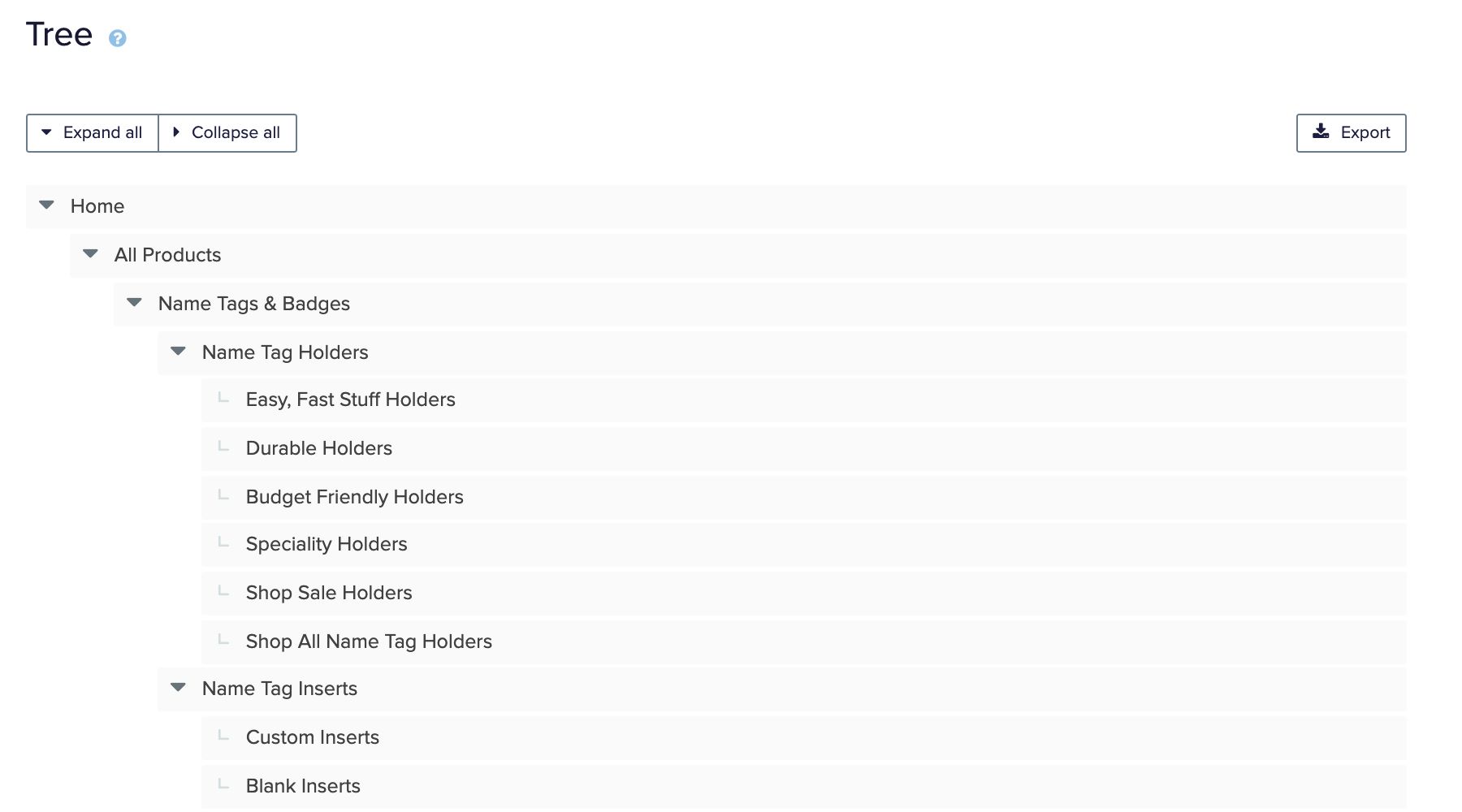
Figure 1.8 - Visual of initial Tree Test to obtain a benchmark score. A Tree Test takes the current site navigation and strips it down to its most basic structure in a nested diagram.
UserBrain.com was used to recruit 50 unmonitored users providing the quantifiable metrics needed to assess the Tree Test. Video recordings of participants provided additional qualitative data. After completing the TreeJack study a score of 66% was set as the benchmark (Figure 1.9) This test also provided insight where the current categorization and navigation needed the most improvement.
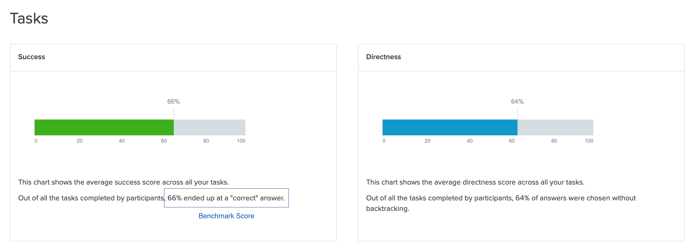
Figure 1.9 - Score achieved after the first round of Tree Testing. Benchmark score obtained was 66% (percent of questions that were answered correctly by users).
After collecting metrics from the TreeJack study, it was important to understand what industry averages were for tree test scores to assess the benchmark. Using scoring sourced from treetesting.atlassian.net (Figure 2.0) it was possible to grade the benchmark. A goal was set to obtain a score of 75 for the new categorization and site navigation.

Figure 2.0 - Screenshot of score definitions from treetesting.atlassian.net. Used to help grade the current categorization and navigation and define an achievable goal for the new structure.
The tree test provided insight into many improvement areas; however, we also wanted to better understand how users would categorize products on their own. An open card sort was performed to gain this insight (Figure 2.1). Optimal Workshop was used to set up the test and collect reporting. UserBrain.com was used to administer tests to 15 users who were given 60 cards to sort. The cards had an image of the product along with the title of the product. Because it was an open card sort, users could create their own categories. The user’s video recordings provided insight into their thinking process.
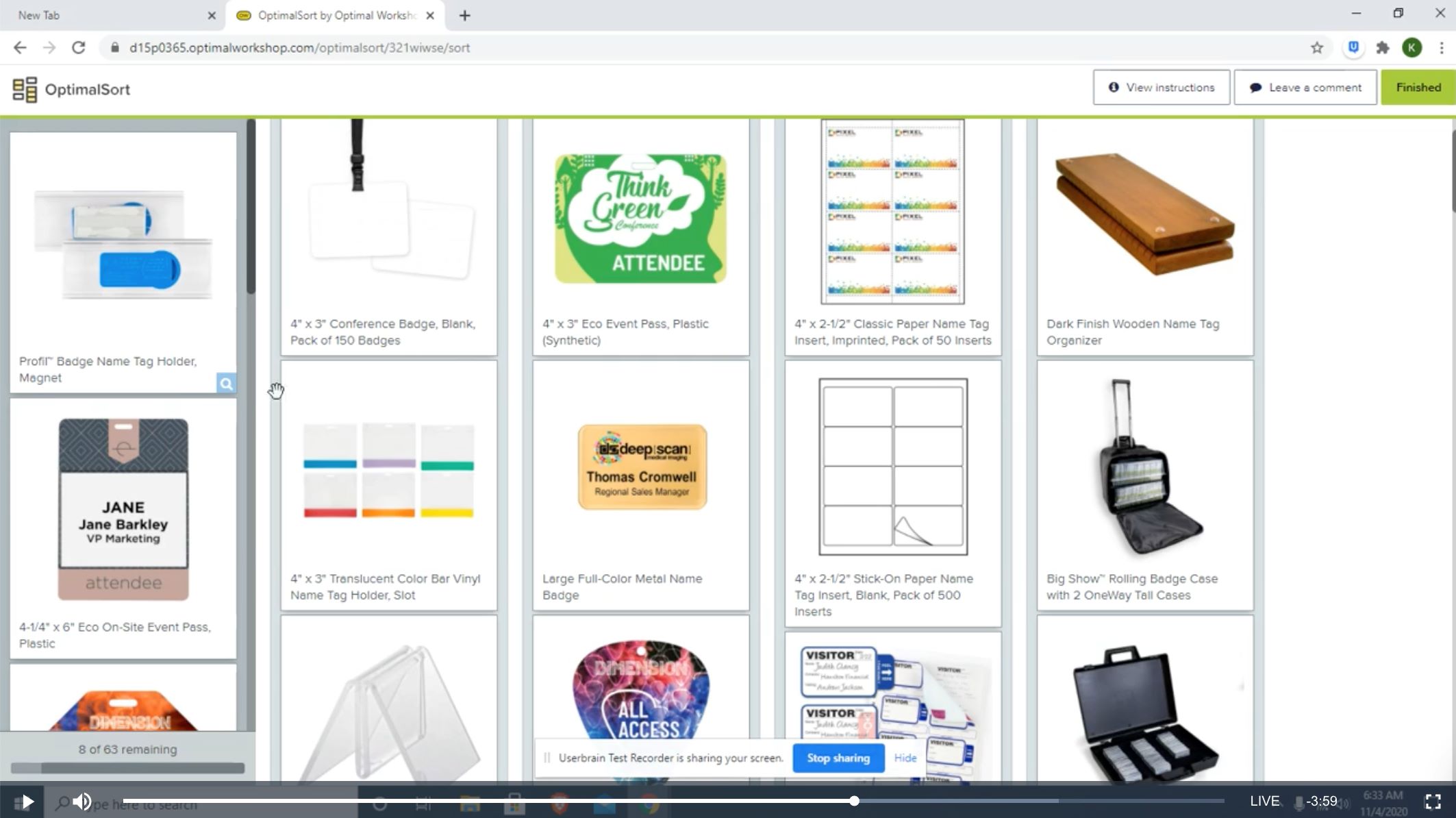
Figure 2.1 - Screenshot of a recording from a user doing an open card sort in Optimal Workshop. Users were given cards with product images and product titles. They could create their own categories.
After performing the Tree Test and Open Card Sort there still was not a strong understanding of which keywords users related with most. Due to the nature of the Tree Test, this information was not provided. During the Open Card Sort most users used the name of the product titles for naming their categories. Working with the marketing department, SEO research was performed to analyze top keywords for product categories (Figure 2.2). This provided the insight necessary to determine if there were opportunities for keywords and category naming.
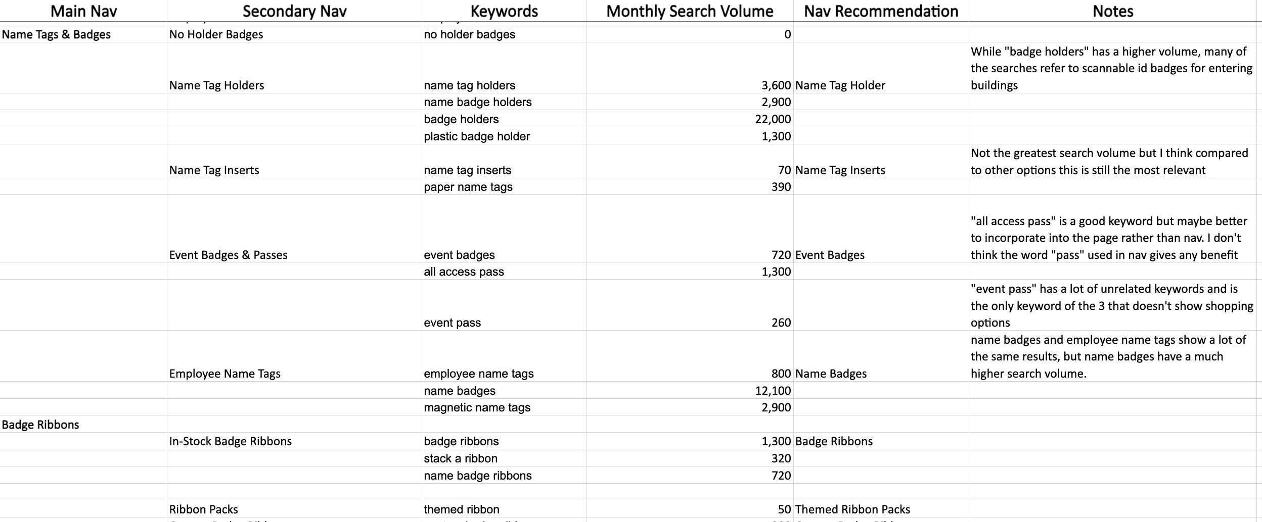
Figure 2.2 - Sample of SEO data collected to determine opportunities for keywords and category naming.
Using the learnings from the Tree Test, Card Sort and SEO Research, a second revised Tree Test study was administered. Using Optimal Workshop and UserBrain the test was administered to 50 Users. This round of testing resulted in an improved score of 71%. However, because this did not meet the defined goal, results were analyzed and more improvement areas were found.
After a third round of Tree Testing, administered again to 50 users using Optimal Workshop and UserBrain, a final score of 80% was obtained, exceeding the original goal.
Now that the product categorization and main navigation structure was defined, the user interface (UI) needed to be updated to fit this structure. The previous UI had all product categories listed under an “All Products” menu (Figure 2.3). Results from the tree tests suggested that it was not beneficial for users to click into this nested menu to discover product offerings.

Figure 2.3 - Image of previous UI from pcnametag.com. Tree tests suggested that this was not an ideal way to display product categories. Users were forced to take an additional click to view product options.
Additionally, in the previous categorization and navigation structure, product’s were buried under several subcategories. In some cases, users were required to take 5 or more clicks before they would reach a shoppable product (Figure 2.4). Following the new information architecture structure and findings from the Tree Test, a user would instead navigate to a category, subcategory and then a product.
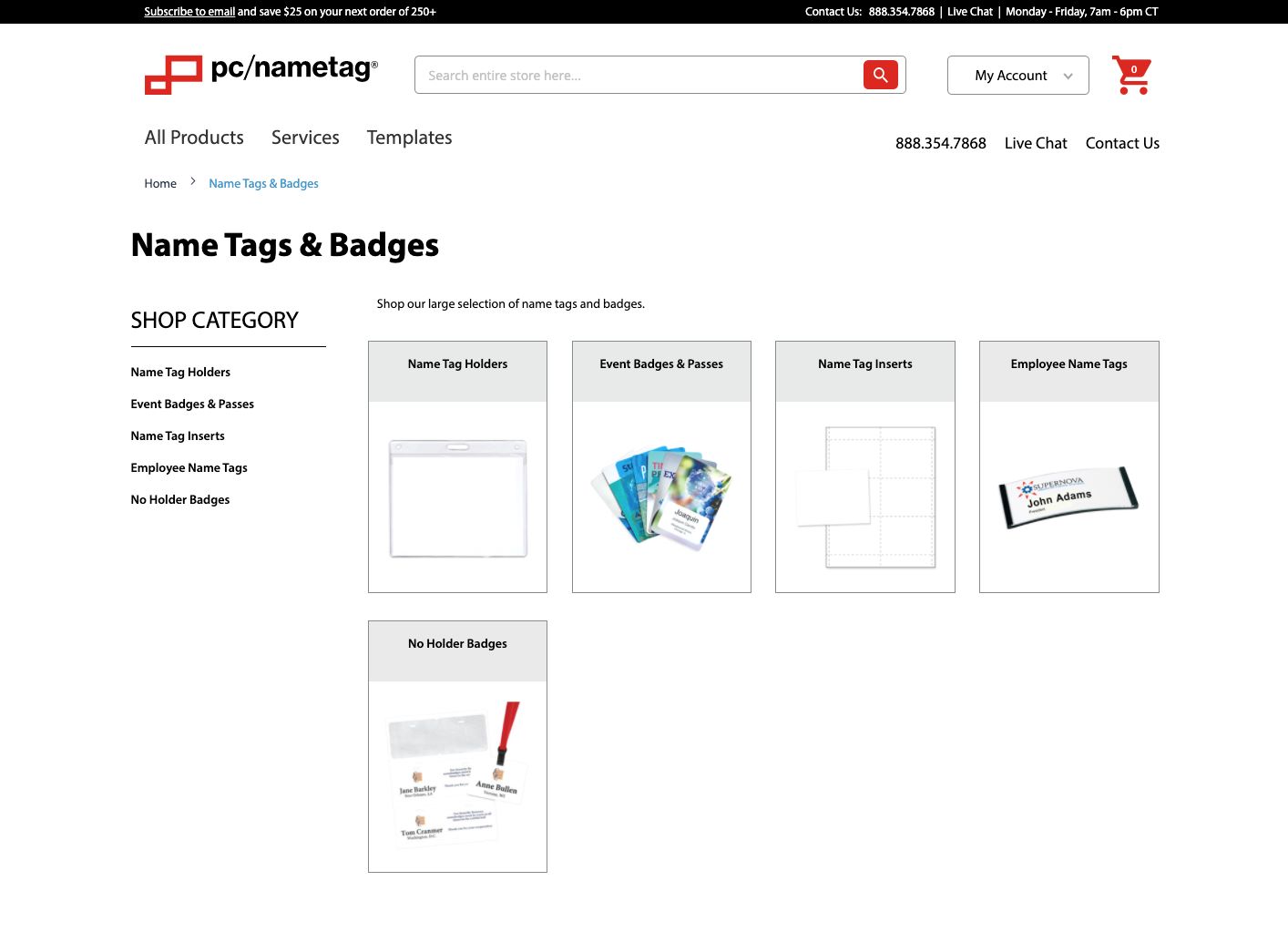
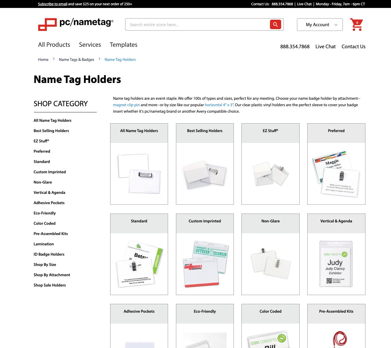
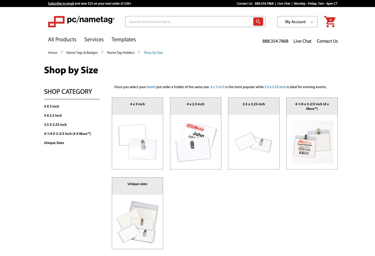

Figure 2.4 - Images of previous UI from pcnametag.com. Users were sometimes required to click through 5 or more subcategories before getting to a shoppable product. This is not a direct or user friendly way to move users through the shopping funnel.
To update the UI, the process included defining how the navigation (main menu & footer) fit into the IA (Figure 2.5). An outline of supporting examples was also provided (Figure 2.6). This process helped to communicate the navigation and UI strategy to department stakeholders so that there was a collective understanding of its purpose and where content exists.
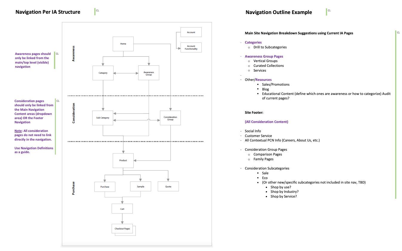
Figure 2.5 - Excerpt of documentation defining how the navigation (main menu & footer) fit into the IA and an outline of supporting examples.
The next step in the process included wireframing initial concepts to visually articulate how the UI could meet the new requirements. Desktop and mobile structures were provided.
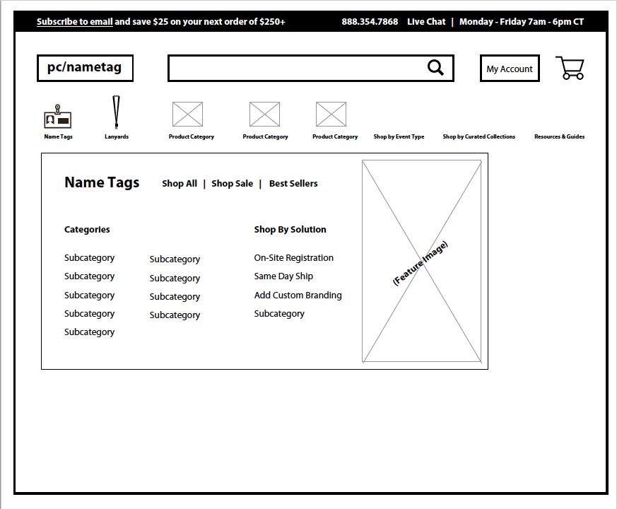
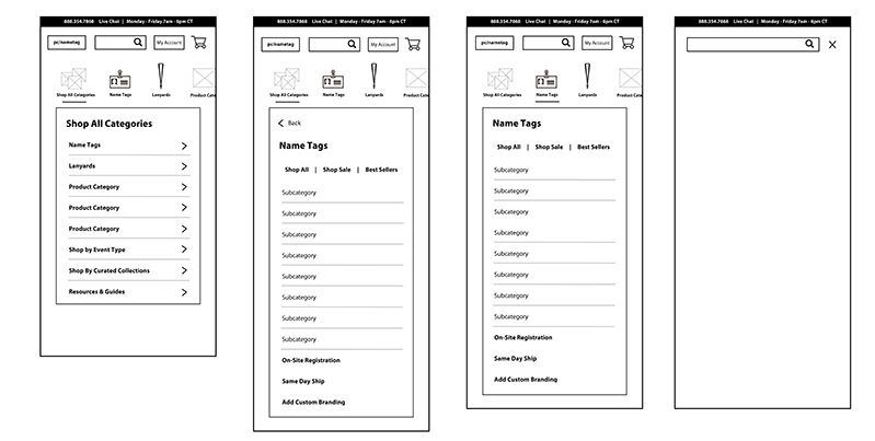
Figure 2.6 - First iterations and concepts of the new main menu.
During the planning of the UI structure, technical limitations were discovered for how to style the new menu. With minimal resources available, a solution needed to be built using a pre-developed module and adapted as close as possible to the preferred solution. And, because delivering an MVP was the focus, we were able to plan to make further UI updates in the future.
After the UI was determined to meet technical limitations, the menu was built out in the ecommerce DEV environment. Using the live prototype, user testing was launched in UserBrain to 3 users on desktop and 3 on mobile. Users were given a scenario and asked to find and select products (Figure 2.7). After testing, tweaks were made to the UI and a plan was put in place to launch the new site categorization and main menu.
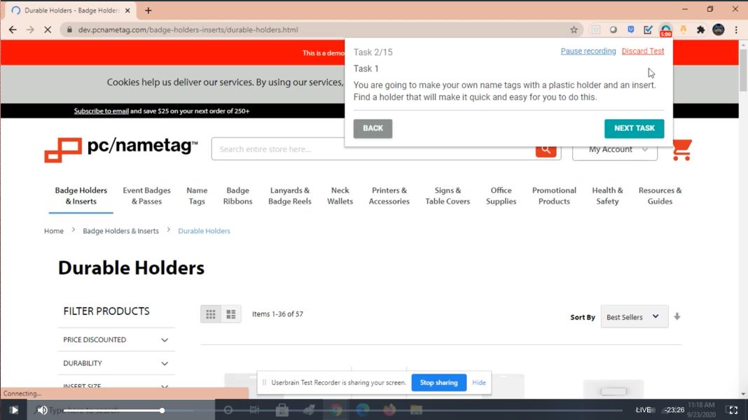
Figure 2.7 - Screenshot of a recording from a user doing a user test of the navigation UI in UserBrain.com. Users tested a live prototype in a DEV ecommerce environment.
Results & Next Steps
The new categorization and main menu was launched on the production site approximately 3 months from start to finish (Figure 2.8). These updates provide users a more efficient and direct way to shop products. In addition, it is now possible to track user funnels for each category to identify drop off points to help influence future iterations.
During initial testing there were indications that there were further opportunities for optimizing the product categorization. Name Tag products still showed the most opportunity in the Tree Test and Open Card Sorts. Two months after launching the first iteration another open card sort was performed focusing only on name tag products. In addition, a second round of SEO research was performed and additional learnings resulted in more modifications to the categorization and main menu.
Future steps include further monitoring the category user funnels using conversion rate and category bounce rate, gathering user feedback with on-page surveys, and working towards a more visual UI to help users identify product selections.

Figure 2.8 - Final categorization and main menu navigation image from pcnametag.com.
Retrospectives
What went well:
- User Testing gave us great insight cross-departmentally.
- Research methodology felt efficient and well thought out.
- Stakeholders were excited with results and findings.
Areas for improvement:
- Open card sort data was widespread because products were so diverse. Separate card sorting tests could have been conducted at high-level product categories to provide narrower results. This was done with the second round of name tag card sorting.
- Due to technical limitations the front-end of the menu UI was not able to be executed as originally planned. Future projects included thorough technical vetting in early stages to determine any limitations and if outside resources needed to be brought in.