A Case Study:
Making Complex Options Simple in Ecommerce
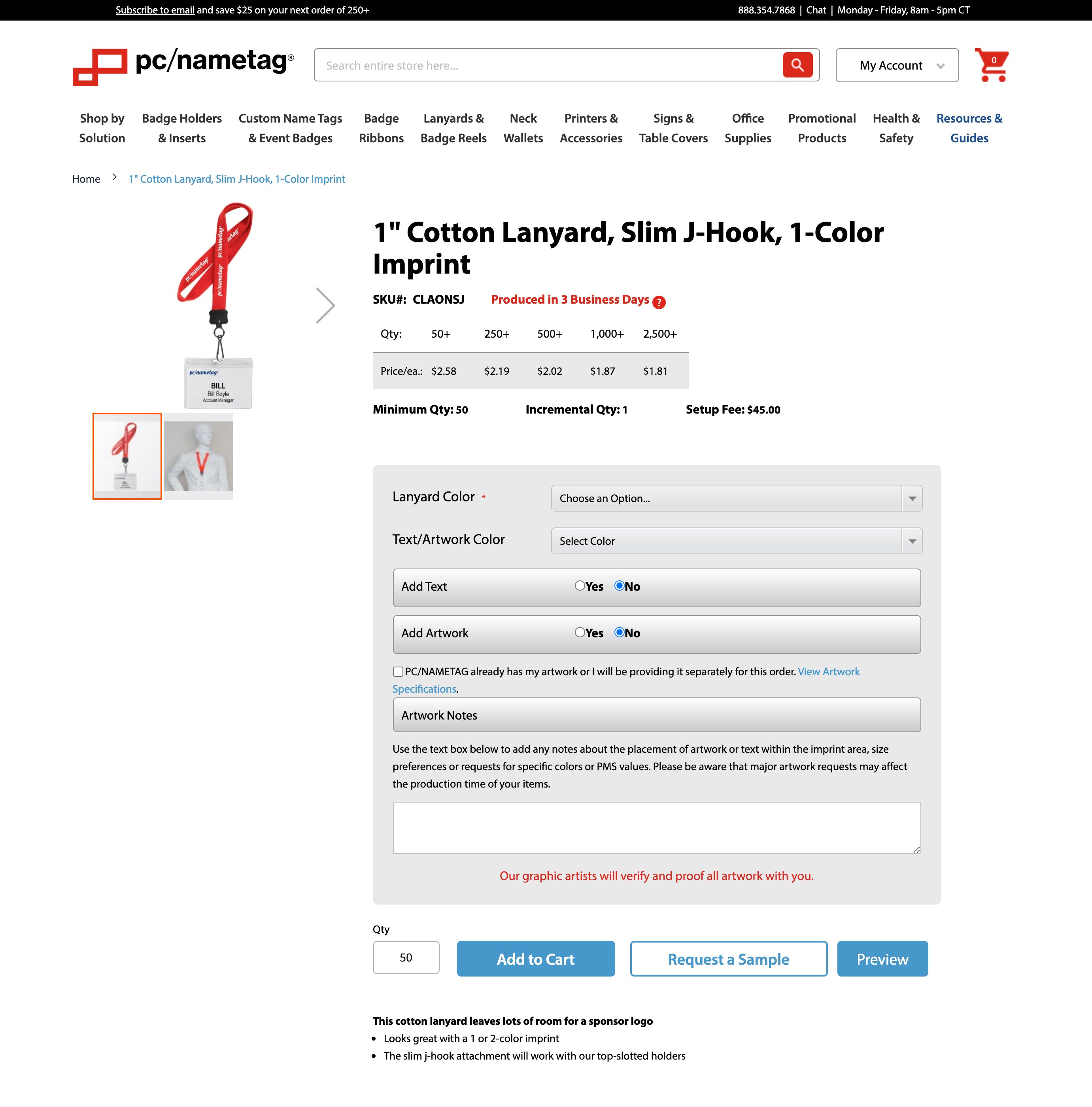
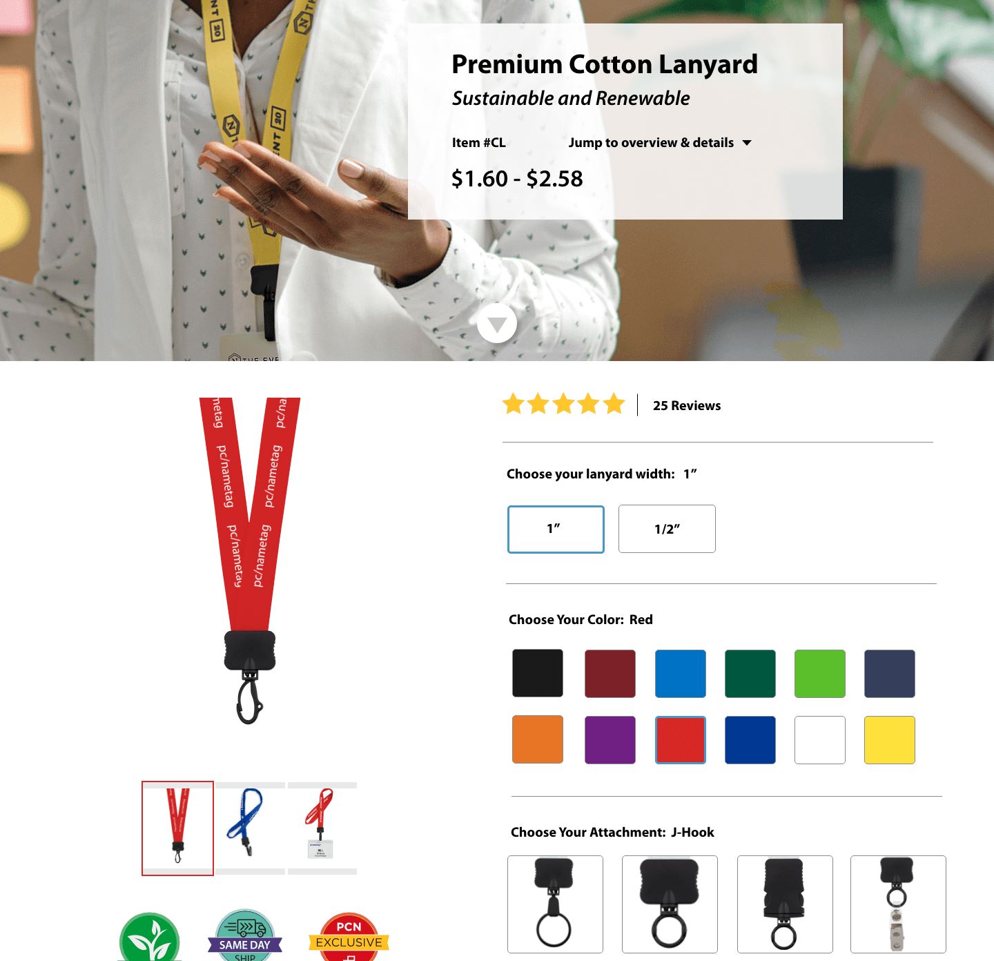
Figure 2.9 - Before and after visuals of product page UI concept.
Project Overview
This project was for pcnametag.com's ecommerce store. They are an event and conference supply business that began as a catalog company. I was the UX lead on this project and worked closely with a ecommerce manager, developer, marketing associates and stakeholders.
The project goal was to simplify complex product lines for users. How products were presented on the ecommerce store were re-evaluated. This evaluation included developing a tiered product page strategy that supported presenting products in a “good, better, best” scenario while providing educational content appropriate to best sell the product.
Challenge
pcnametag.com’s product pages were initially set up with a catalog-first strategy. Products and SKUs were displayed online in the same way a catalog would show the final purchased product. For example, if a user wanted to purchase a cotton lanyard with a j-hook attachment, they would need to locate a single product page with this option. (Figure 3.0) Ideally, a user would be taken to a product page of a single family and the page would support configurations of the product. By displaying products in this manner, it would dramatically reduce the number of product pages a user would need to sort through to find their solution. As an example, when this project was kicked off, pcnametag.com’s lanyard category included 368 pages. With the tiered product pages and new SKU strategy in place this would bring the page count down to 38 pages. All product categories would need to be evaluated.

Figure 3.0 - Example of a lanyard product page. This example shows a cotton lanyard with a j-hook attachment. Other lanyards within the cotton lanyard product family are on separate product pages.
Approach
- Interview department stakeholders to define the vision of a tiered product page strategy.
- Understand current SKU structure and technical limitations.
- Sketch out low fidelity wireframes to brainstorm initial page concepts with department stakeholders and technical team.
- Build out high fidelity wireframes and prototypes to further validate concepts.
- User test prototypes to gather qualitative data to ensure the page met primary and secondary objectives in accordance with pcnametag.com’s information architecture.
- Build out the front-end framework of the product page.
- Modify page UI to support technical challenges and evaluate how to handle product specific nuances that were not initially uncovered in the planning stages.
- Finalize product launch process and prepare for launch of first product page.
Process & Research
To kick off the process for planning the new tiered product pages, formal and informal conversations with department stakeholders were had around the strategy and vision for the product pages. We were able to develop page goals that included:
- Develop tiered pages that supported a good, better, best approach providing educational content appropriate to best sell the product.
- Templatize the page to allow for consistent content, structure, navigation and build familiarization across the site.
- Condense the number of product pages by combining similar SKUs onto a single product page, allowing users to more efficiently and effectively find and discover product solutions.
- Allow opportunities to up-sell and cross-sell related products or services to increase AOV.
- Promote product specific sales and offers.
- Build the groundwork for bundling products as well as making all products orderable online.
These goals and the definitions outlined in the Information Architecture process gave us enough information to begin planning and building out the new product pages.
With a clear view of goals and technical limitations, initial wireframes of the product pages were created. The goal of these wireframes was to begin to articulate thoughts on how the tiered pages could be displayed and how a user would select product configurations. (Figure 3.2) Modifications were made to these wifreames with insight added from department stakeholders.
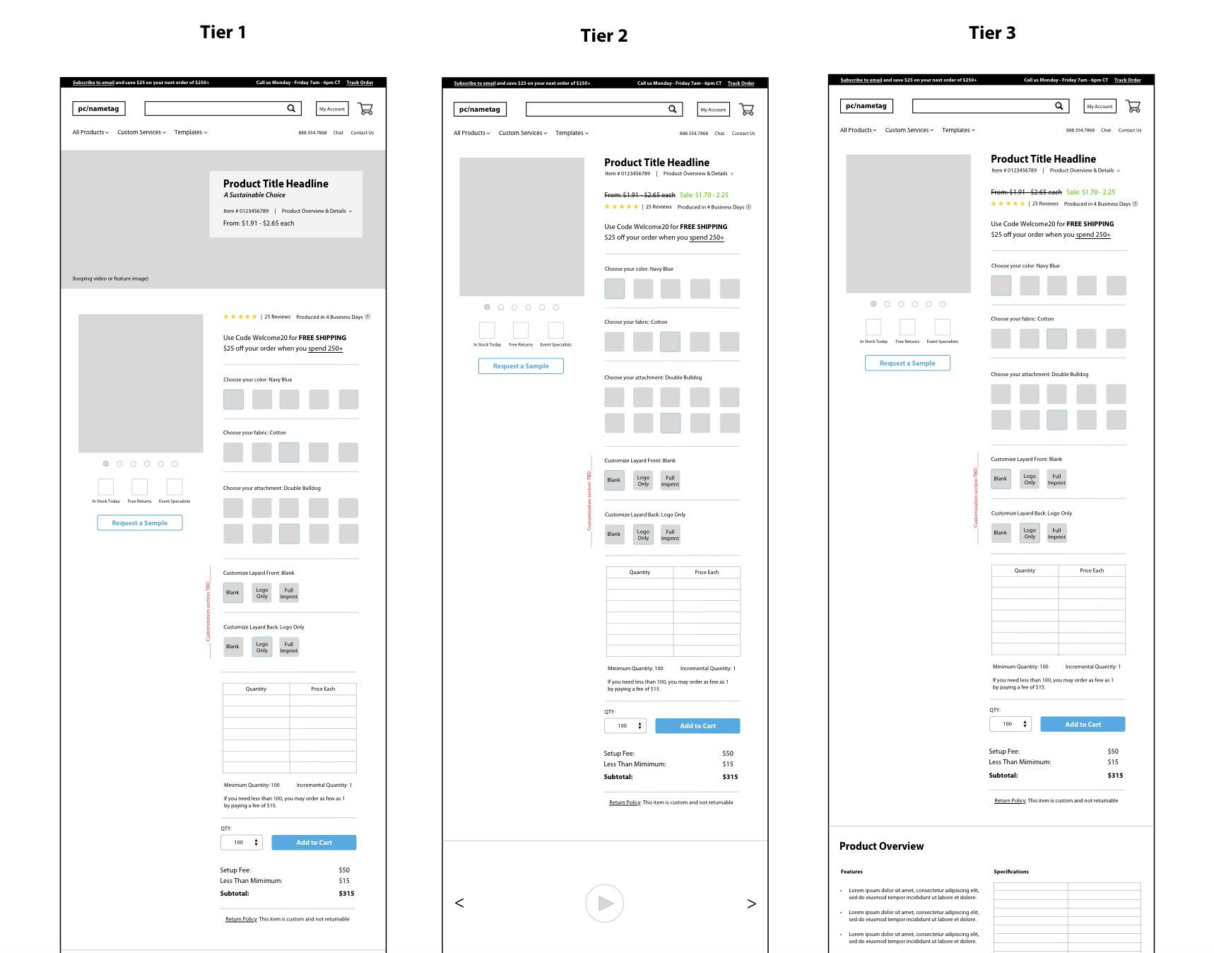
Figure 3.2 - Initial wireframe concepts of tiered product pages.
Once there was alignment on how to display the tier pages and there was good feedback on how the UI was starting to be presented, high fidelity mockups were made of the product pages. These were designed using a product that was not in the pc/nametag product category. A configurable shoe concept was used to avoid confirmation bias and challenge potential existing beliefs. The high fidelity mockup was turned into a workable prototype that would be used for user testing the page concept (Figure 3.3).
Figure 3.3 - Recording of prototype for configurable shoe concept used for user testing new tier product pages. User is scrolling through the image carousel and selecting product configurations.
The main objective of user testing was to determine if the initial layout hypothesis met the primary and secondary objectives of the product pages. User testing was conducted on UserBrain.com with an unmonitored test that provided video recordings of users performing the test. Twelve users in four groups were tested:
- Six users tested a Tier 1 product page.
- Three users tested a Tier 2 product page.
- Three users tested a mobile product page.
Users were asked a series of questions on each of these layouts. Questions included asking the user to:
- Provide an overview of what the page was offering.
- Provide an overview of how they would shop the page.
- Answer questions and perform tasks that outlined if content was findable.
- Ensure usability of Tier 1, 2 and 3 product pages on desktop and mobile devices.
Based on users' responses, tweaks were made to the UI of the product page. An example of this is during mobile testing, users were provided three different concepts to determine the most preferred way to select product configurations on the page. Unanimously, users preferred version #1 (Figure 3.4).
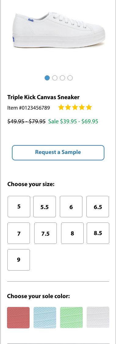
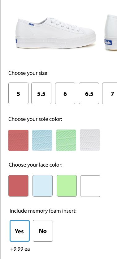
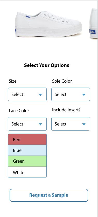
Figure 3.4 - Three different UI concepts of mobile product configuration layouts. These were provided to users during user testing to determine the best mobile specific layout. All users preferred version 1 (left).
Once user testing was complete and findings were shared out with department stakeholders and approvals were given, the development process was able to begin. As the UX Designer, I also acted as the frontend developer for this project. I provided an HTML page and CSS stylesheet that included a responsive structure and fully styled components.
As the product pages were being developed, and more work was done to determine how products would combine, technical challenges emerged from product specific nuances that were not initially uncovered in the planning stages. An example of this was how pricing was displayed on the product page. Currently, all products show a price table that allows for quantity price breaks. Because pages are combining several different children SKUs that could have a different pricing structure, the page needed to support showing pricing dynamically after a user selects all the product configurations. To solve for this, instead of showing a static price table, a user would be presented with a “price each” figure. (Figure 3.6) A user would input their quantity and the price each would update to show their cost for each unit.
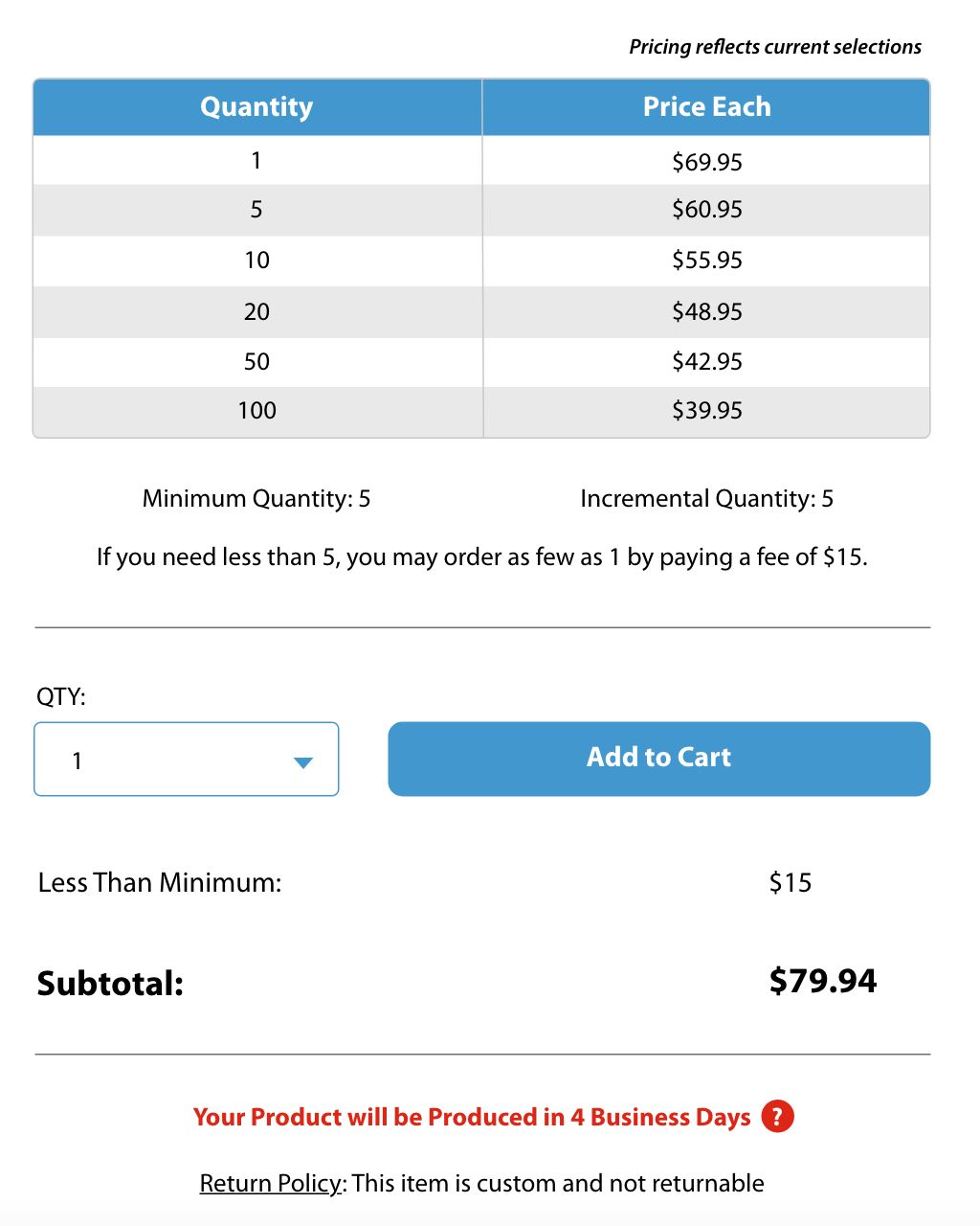
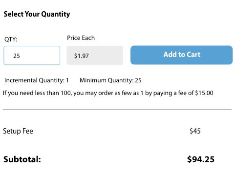
Figure 3.6 - Iterations of pricing section on product page. Version 2 (right) better supported technical constraints for showing pricing dynamically on page. This also simplified cognitive load for users by not showing every price tier.
A second example discovered was that not all products on the website had a predetermined selection of imprint colors. Some products allowed users to order any imprint color that they wanted. The UI needed to be modified for select products to allow for an infinite number of color selections. A color picker was implemented (Figure 3.7) that allowed users to either visually select a color or they could input a hex value.

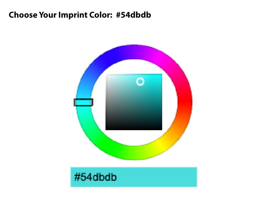
Figure 3.7 - UI examples of different ways to select imprint colors to support product specific options. (left: defined colors, right: infinite colors)
With the development of the pages well underway, final steps included coming up with a project execution plan and assigning out marketing needs for the pages. It was determined that the best approach was to launch new pages one at a time to allow the marketing department time to provide brand new photography and copy. This would also help with monitoring the pages to ensure users were able to easily use them and checkout. Modifications would be able to be made if any roadblocks were to appear.
Results & Next Steps
Due to the complexity of the project and being built 100% in-house, the goal was to launch the pages by category with lanyards being first. (Figure 3.8) Pages will be built out until complete and assessed continuously.

Figure 3.28 - Sample of one of the first product pages launched.
Retrospectives
What went well:
- Project provided opportunities for efficiency cross-departmentally.
- All departments contributed to the project and were active participants in determining the final outcome.
- Entire process gave valuable insight to infrastructure limitations and capabilities.
- Project was less siloed than previous projects.
Areas for improvement:
- Development process is taking longer than expected. Sprint planning sessions include putting non-urgent projects in the backlog to prioritize development of the project.
- Because the project is taking several months; project goals and priorities needed to be re-reviewed several times with department stakeholders. Team GANTT and Jira board are now being shared out with leadership teams to allow them to check on progress.
- ERP complexities made understanding technical requirements difficult. This project uncovered ERP improvement opportunities.